SELECT * FROM 'minard_troops.csv' LIMIT 5| long | lat | survivors | direction | group |
|---|---|---|---|---|
| 37.7 | 55.7 | 100000 | R | 1 |
| 37.5 | 55.7 | 98000 | R | 1 |
| 37 | 55 | 97000 | R | 1 |
| 36.8 | 55 | 96000 | R | 1 |
| 35.4 | 55.3 | 87000 | R | 1 |
In 1812 the French emperor Napoleon waged a military campaign invading Russia. The campaign had early tactical success and Napoleon briefly occupied Moscow. However, the campaign was a strategic failure because the retreat from Russia back to France was a catastrophe. Charles Joseph Minard is best known for visualising numerical data about this campaign showing the advance and retreat.
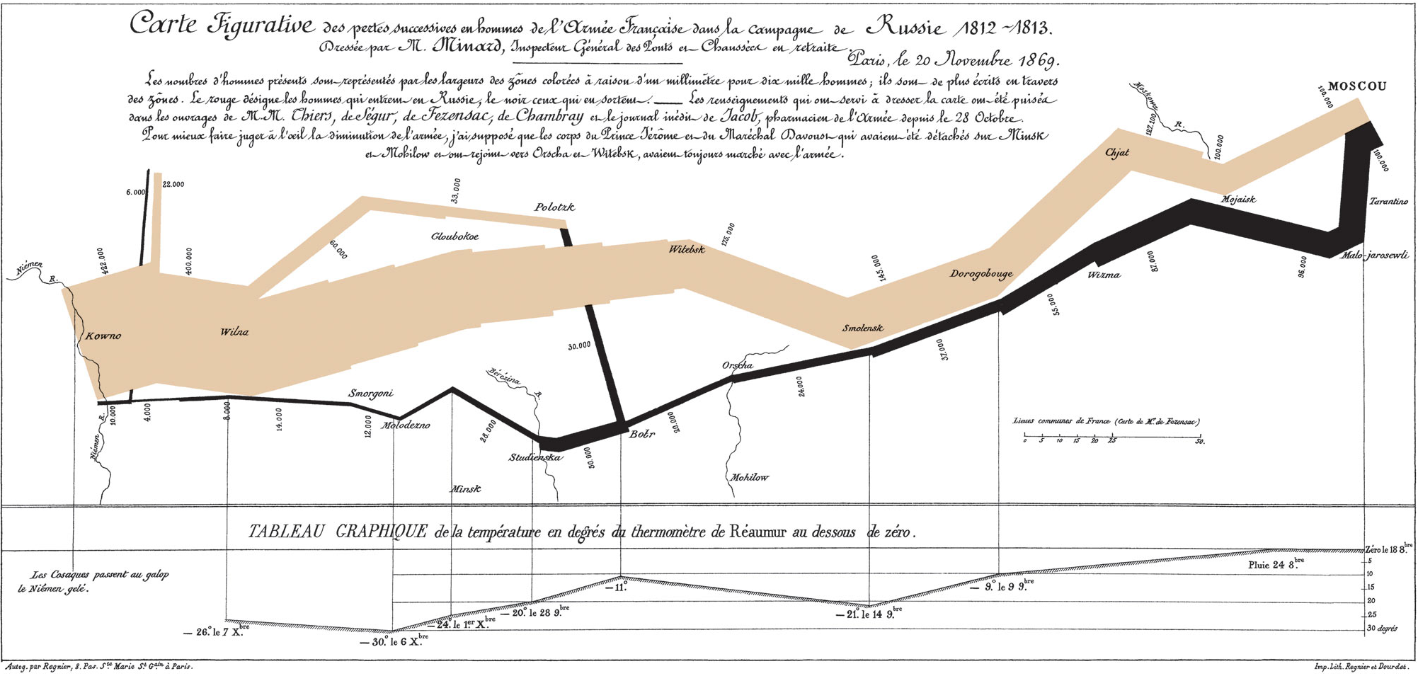
In this example, we’ll recreate the top part of the infographic. The particular incarnation of the data that we’re using here is adapted from the HistData R package (Friendly 2002).
Before building a graphic it is always good to be aware of the columns and data structures that are present in your data.
SELECT * FROM 'minard_troops.csv' LIMIT 5| long | lat | survivors | direction | group |
|---|---|---|---|---|
| 37.7 | 55.7 | 100000 | R | 1 |
| 37.5 | 55.7 | 98000 | R | 1 |
| 37 | 55 | 97000 | R | 1 |
| 36.8 | 55 | 96000 | R | 1 |
| 35.4 | 55.3 | 87000 | R | 1 |
Our first goal is commit something to paper. We’ll iron out mistakes and polish the graphic later.
VISUALISE long AS x, lat AS y FROM 'minard_troops.csv'
  DRAW line
To explain what we have done here:
VISUALISE ... 'minard_troops.csv' queries a local CSV file for Napoleon’s troops.long AS x sets the long (longitude) column as the x aesthetic.lat AS y sets the lat (latitude) column as the y aesthetic.DRAW line instructs to plot to use the line layer.No celebrated military strategist would plan his troop movements towards Moscow in this fashion though. The chart only shows movement in the west-east direction, meaning that we are not capturing the retreat properly.
The first ‘mistake’ we made is choosing the line layer. Line layers automatically sort along the axis, so we’re mixing coordinates from the advance and the retreat. To rectify this, we should use the path layer instead. Path layers connect datapoints in the order they appear in, so we’re no longer sorting along west-east.
VISUALISE long AS x, lat AS y FROM 'minard_troops.csv'
  DRAW path
The second mistake is that Napoleon’s retreat was not a simple linear path. For example: a detachment of soldiers arrived in Polotsk to guard the northern flank. This detachment later joined up with the remainder of the army during the retreat. What that means for us is that we have to account for additional grouping. This grouping allows us to resolve separate paths.
VISUALISE long AS x, lat AS y FROM 'minard_troops.csv'
  DRAW path
PARTITION BY direction, groupOne of the appealing aspects of Minard’s visualisation is that it is rich. Not only does it display a map and the route of the army; it also separates the advance from the retreat in different colours, and displays the troop numbers as line thickness. We can also separate the advance from the retreat by mapping the direction variable to the stroke colour.
VISUALISE long AS x, lat AS y FROM 'minard_troops.csv'
  DRAW path
    MAPPING direction AS stroke
    PARTITION BY direction, group
Similarly, we can include the troop numbers by mapping the survivors variable to the line width.
VISUALISE long AS x, lat AS y FROM 'minard_troops.csv'
  DRAW path
    MAPPING direction AS stroke, survivors AS linewidth
PARTITION BY direction, groupNow that we have all the data included in the ways we want, we can start detailing the graphic to our tastes. The first thing we might do is to pick some better colours. Because we have two levels for the direction variable —Advance and Retreat— we can create a new colour scale for the stroke aesthetic. We’ll choose the colours to more closely resemble the original graphic by Minard. We set the palette using the TO keyword, and format the labels using RENAMING.
VISUALISE long AS x, lat AS y FROM 'minard_troops.csv'
  DRAW path
    MAPPING direction AS stroke, survivors AS linewidth
    PARTITION BY direction, group
  SCALE stroke TO ('burlywood', 'black')
    RENAMING 'A' => 'Advance', 'R' => 'Retreat'
Now for a slightly more complicated scale, we’re going to set one for the linewidth variable that represent the number of troops. If you want to build in some extra intuition for the scale, you can let 0 troops coincide with 0 linewidth. We define the output range using TO (0, 20) because for a continuous variable it expects the output limits. Slightly more elaborate is the input domain, where we use FROM (0, null) to state that the scale should start at 0 and go up to the largest value in the data. Because both the input and output ranges start at 0, we get a well-proportioned line.
VISUALISE long AS x, lat AS y FROM 'minard_troops.csv'
  DRAW path
    MAPPING direction AS stroke, survivors AS linewidth
    PARTITION BY direction, group
  SCALE stroke TO ('burlywood', 'black')
    RENAMING 'A' => 'Advance', 'R' => 'Retreat'
SCALE linewidth FROM (0, null) TO (0, 20)While this map is nice, it is a little bit lacking in context. For sure the longitude and latitude coordinates are meaningful to cartographers among us. However, for the rest of us we may like some city names to contextualise the march a bit. There is a separate dataset wherein we’ve saved the city coordinates and their names. We can use this by adding a second DRAW layer. Note that long AS x, lat AS y is applied globally, so it also applies to our city layer. In our new layer, we need so set additional mapping city AS label and the new dataset using FROM. We can also make text a little bit smaller by setting the font size.
VISUALISE long AS x, lat AS y FROM 'minard_troops.csv'
  DRAW path
    MAPPING direction AS stroke, survivors AS linewidth
    PARTITION BY direction, group
  DRAW text
    MAPPING city AS label FROM 'minard_cities.csv'
    SETTING fontsize => 6
  SCALE stroke TO ('burlywood', 'black')
    RENAMING 'A' => 'Advance', 'R' => 'Retreat'
  SCALE linewidth FROM (0, null) TO (0, 30)
An additional obvious way to polish your graphic is to add nicer titles for all your variables. We can use the LABEL statement to add custom labels for our plot. In the title, we escape the single quote mark by using \' so that we know it is not the end of the string yet. Moreover, we can use null to note that a title should be removed. In that way we can hide the long and lat labels from the position mapping.
VISUALISE long AS x, lat AS y FROM 'minard_troops.csv'
  DRAW path
    MAPPING direction AS stroke, survivors AS linewidth
    PARTITION BY direction, group
  DRAW text
    MAPPING city AS label FROM 'minard_cities.csv'
    SETTING fontsize => 6
  SCALE stroke TO ('burlywood', 'black')
    RENAMING 'A' => 'Advance', 'R' => 'Retreat'
  SCALE linewidth FROM (0, null) TO (0, 20)
  LABEL
    title => 'Napoleon\'s Russian Campaign',
    subtitle => 'Inspired by the graphic of C.J. Minard',
    linewidth => 'Troops',
    stroke => 'Direction',
    x => null,
    y => null
And there we have it: a reproduction of Minard’s infographic on Napoleon’s Russian campaign.